A few months back, I was chatting with our CEO when mention of our plans to revamp SkillsDB was first made. And I am very excited to inform our dear clients that these changes have started rolling out.
We put a lot of thought, planning, time, and effort into improving the interface and page structure of SkillsDB to give users a more modern feel.
Our thought process on this was to create a user experience that is not much different from the modern look you get on your mobile devices and laptops. Managing your skills is serious business, but it doesn’t have to look Jurassic 🙂
Simplifying Pages
If there’s one phrase we want people to think about when using SkillsDB, it is “simple and effective”.
There are quite a few softwares out there that do what SkillsDB does, but setting them up and using them is usually a mammoth, complicated process.
However, SkillsDB offers an easy solution to skills management, but that doesn’t mean we’re satisfied with “easy”. We prefer “very easy”, and so we continue to look for ways to simplify our system.
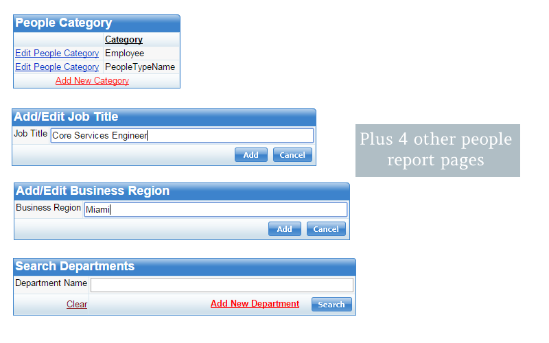
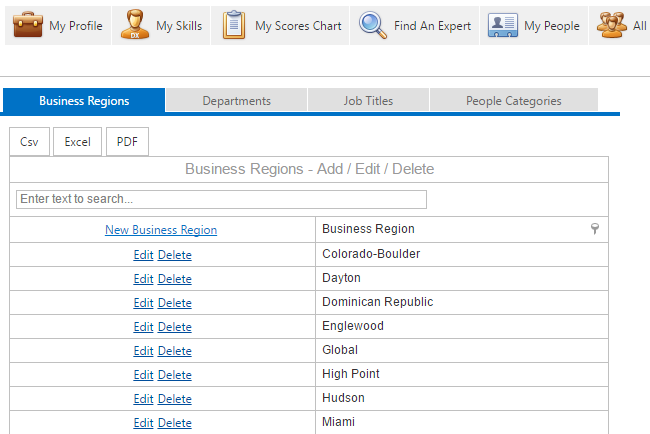
To this point, we formerly used to have 8 different pages for setting up personnel details. But with our latest update, we combined them all into a single page that is twice as simple, twice as functional, and frankly, 10 times better looking than the previous pages. You might even say this page went under the knife.
Previous interface. People management was made up of 8 different pages
New interface. People management is done from a single page
So when a person wants to work with personnel setup, they can go to a single page and simply switch tabs to access different sections.
Improving the look and feel
We started rolling out the changes to our interface a few months ago.
We began with the main skills management page for employees, and have gradually started to apply the changes to other pages.
With this new interface, users can manage their skills with a modern look and feel, including the bells and whistles we’ve come to expect like rotating waiting indicators, and more.
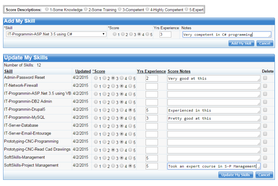
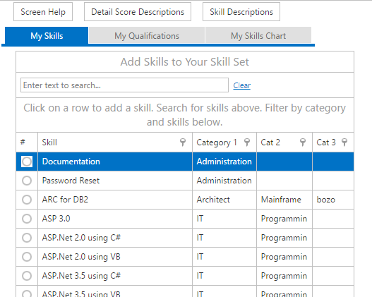
Below, you can see the changes to the revamped SkillsDB interface.
Previous skills management interface
New skills management interface
One prominent feature of this new interface is the on-page help button. This means you do not need to go to any other page or consult any help document to get most of your answers. Instead, you simply click the screen help button and this launches a video guide on how to use the current page.
In upcoming months, you will continue to observe these changes in yet other areas of the software. It is our aim to phase out the older interface and replace completely with the new one by early next year.
As we make these changes and add new features, we would always appreciate your input and reviews. If while working, you think about a feature that will make your life easier, please do send a message about it to steve@skillsdbpro.com.
We greatly value your suggestions!
By: Mesheal Fegor
Sales & Support
http://skillsdbpro.com


